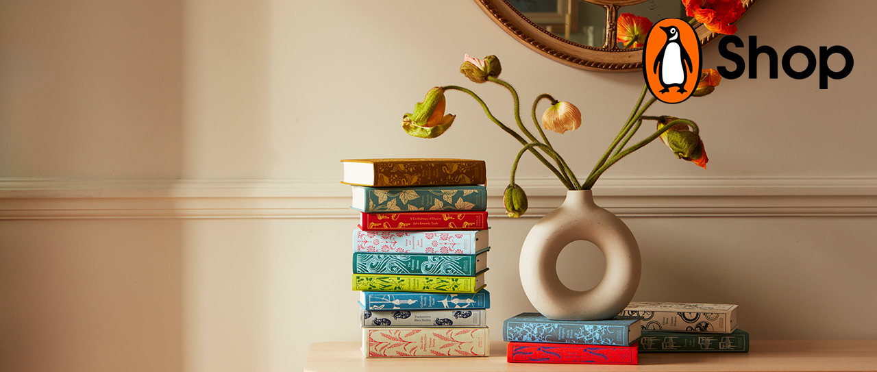
- Home |
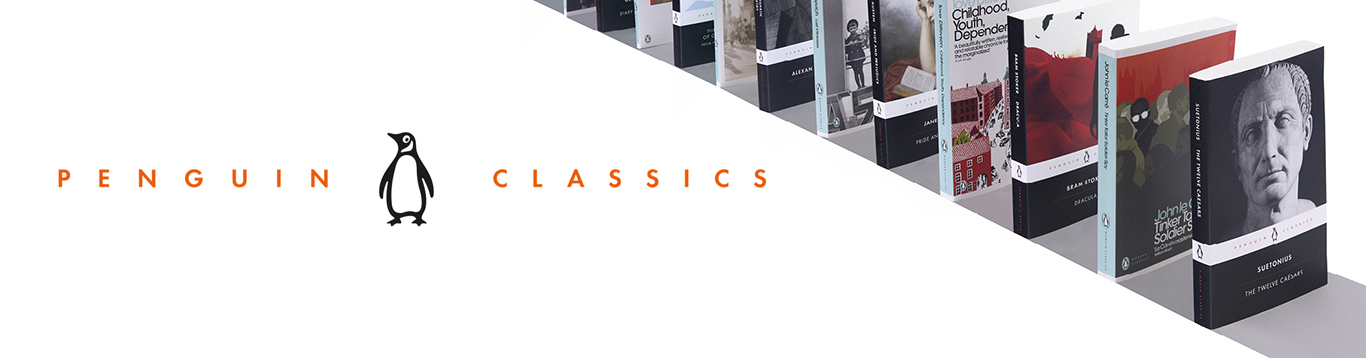
- Penguin Classics
Penguin Classics
Latest releases
View more

Celebrating Italo Calvino
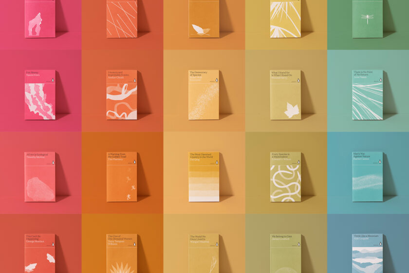
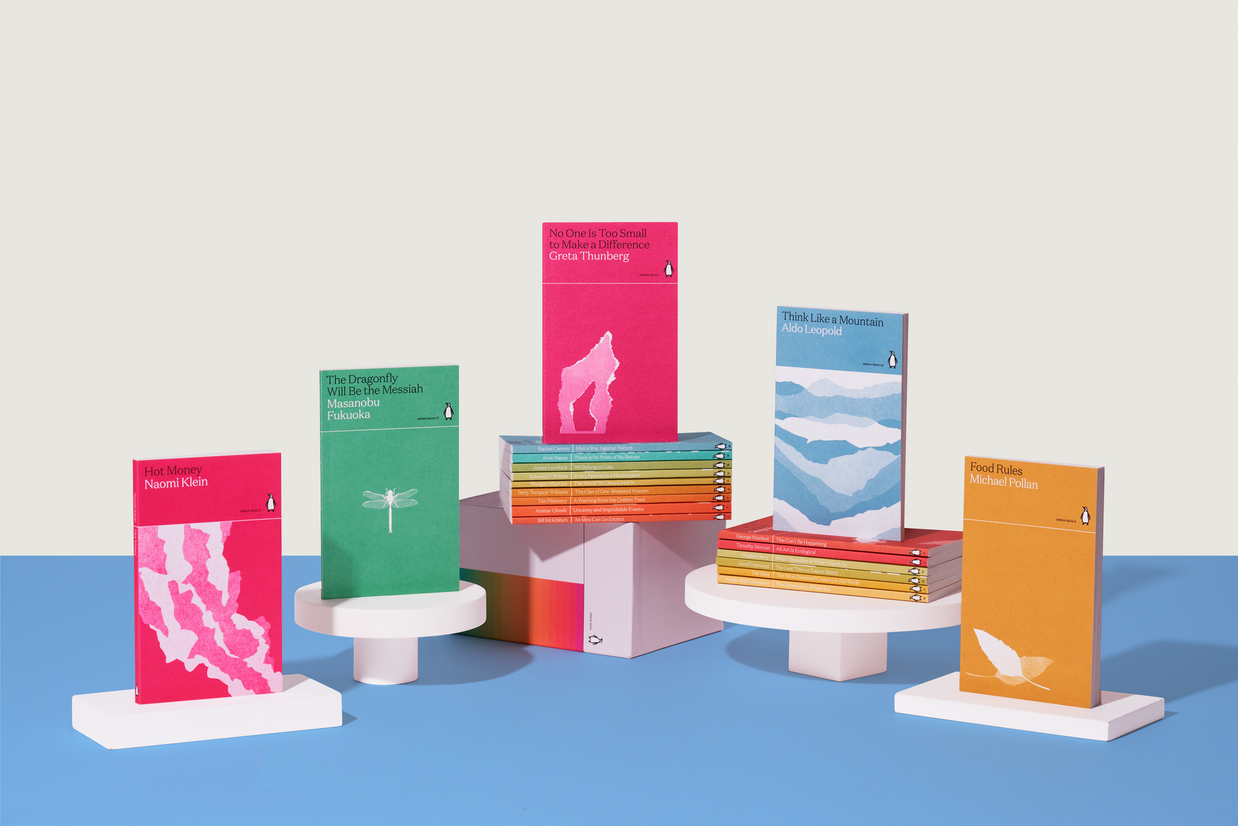
Green Ideas
View more
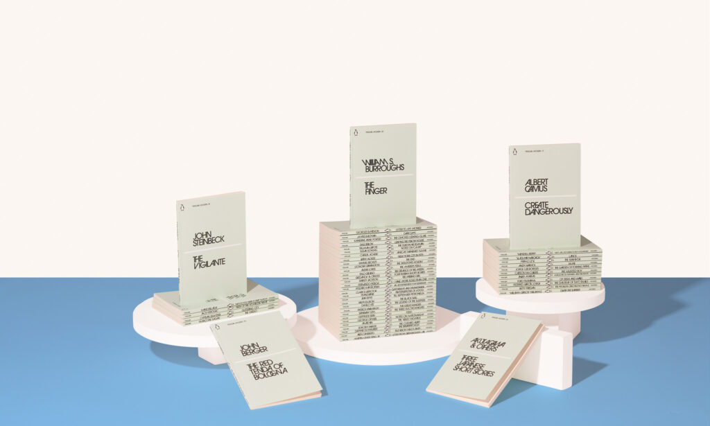
Penguin Great Ideas
View more
Penguin Science Fiction
View more
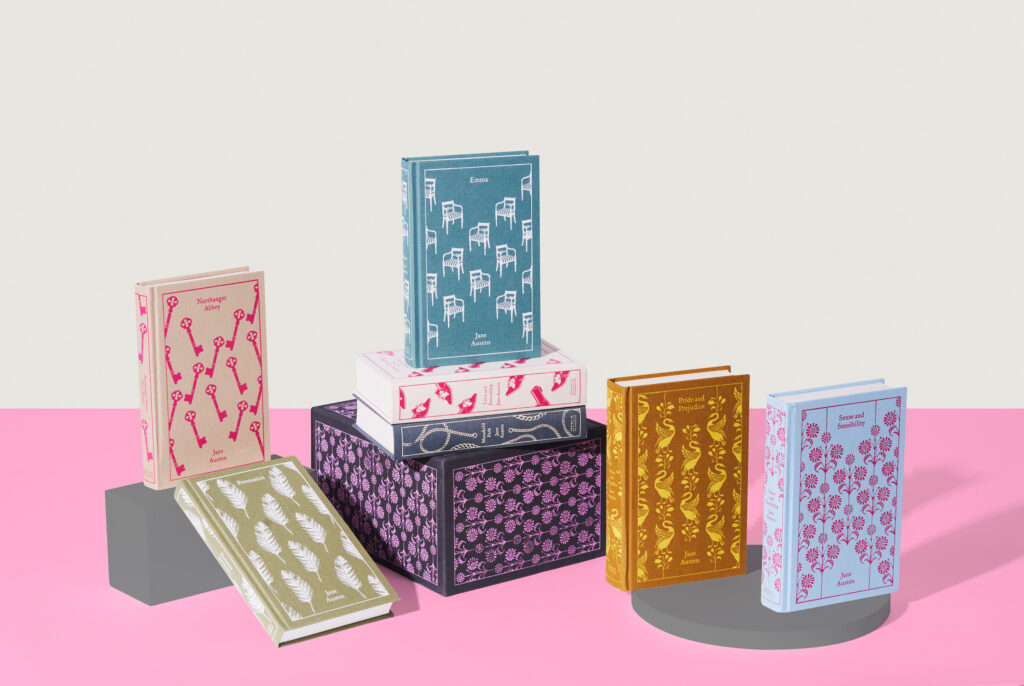
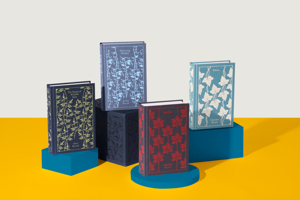
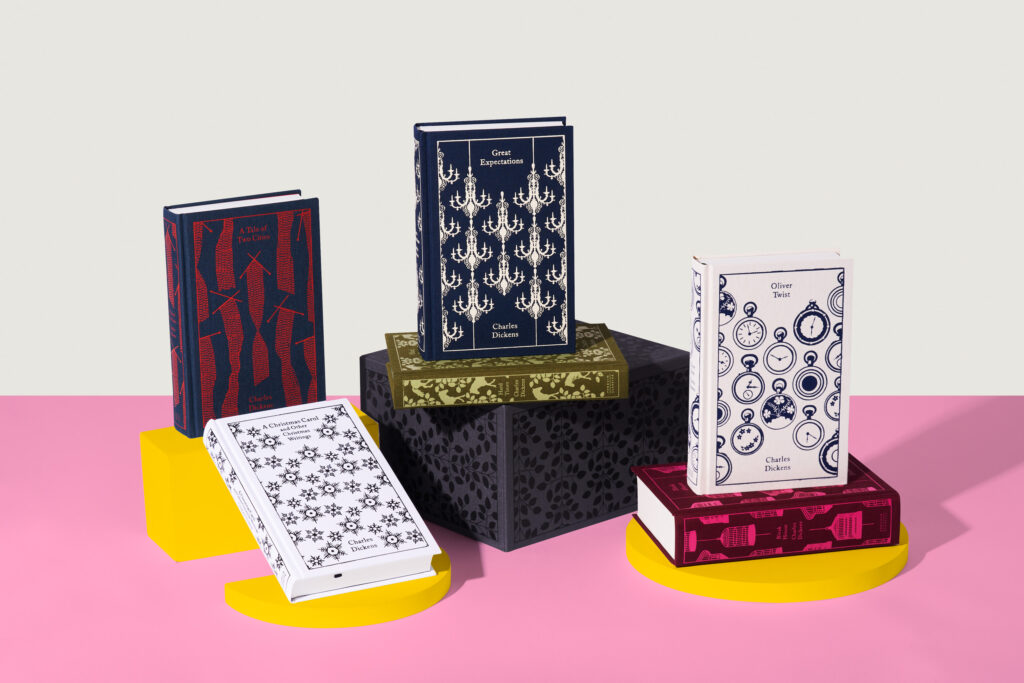
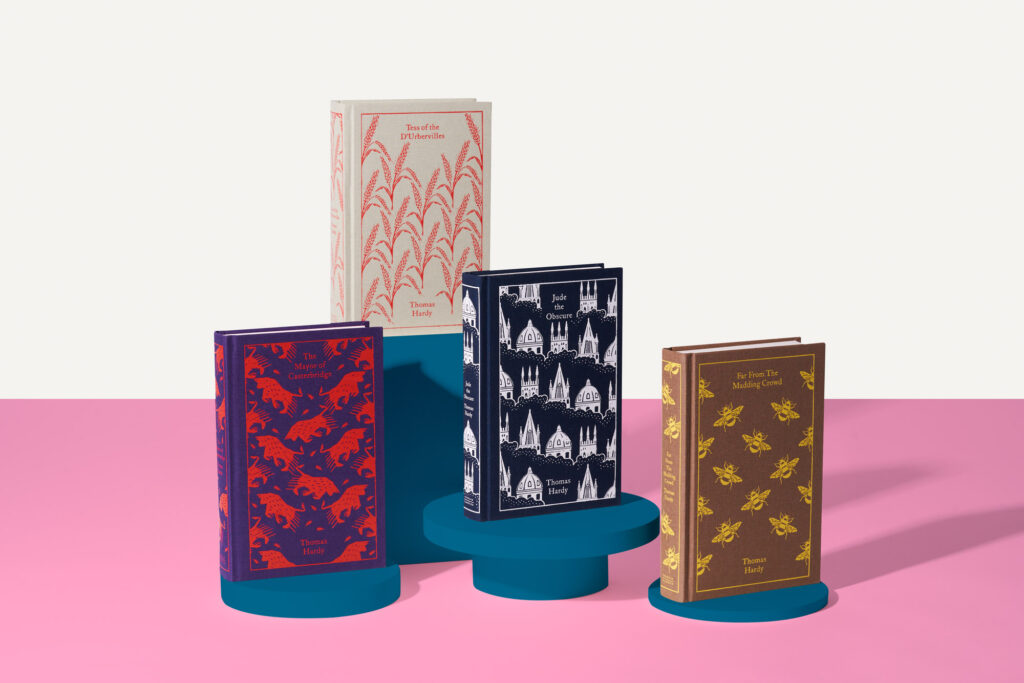
Clothbound Classics
View more
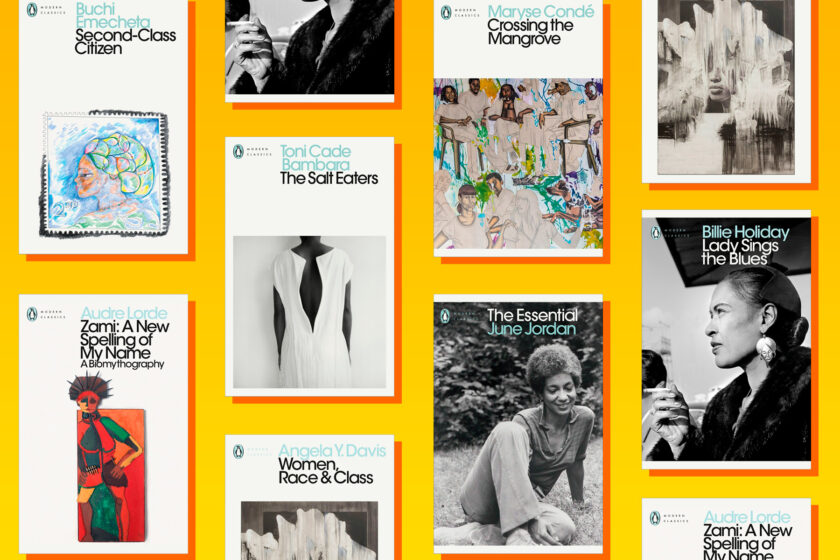
Modern Classics
View more
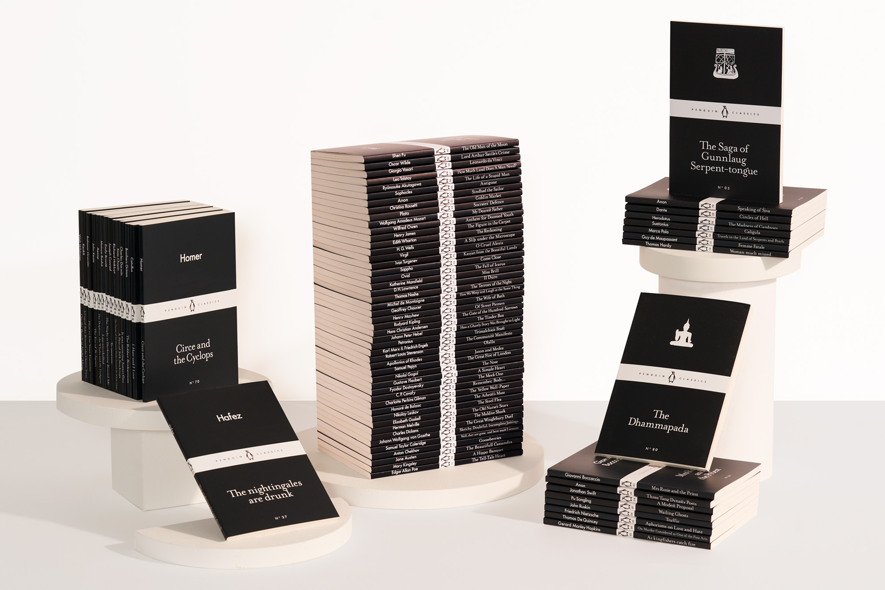
Black-spine Classics
Penguin Classics in Audio
View more
Explore George Orwell in Penguin
View more
Read John le Carré's books
View more
Boxed sets and collections
Bestselling Classics
The best books ever written. Choose from Clothbound Classics, Penguin Modern Classics, Penguin English Library, and more, while enjoying our special multi-buy offers.
Shop now
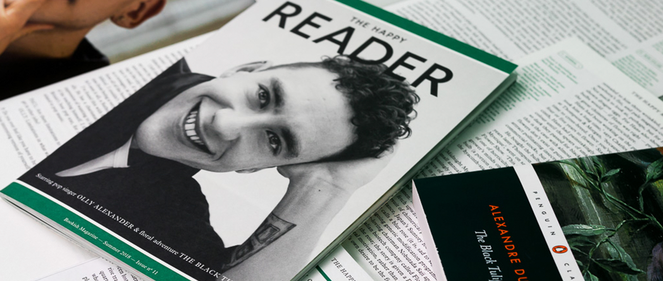
A Bookish Magazine
The Happy Reader
The Happy Reader is a unique magazine about reading for anyone who wishes to stay inspired, informed and entertained.
Learn more
Sign up to the Penguin Classics newsletter
By signing up, I confirm that I'm over 16. To find out what personal data we collect and how we use it, please visit our Privacy Policy